DaVinCi (达·芬奇)
是什么
在Android上取代xml方式定义 Shape/GradientDrawable 以及 ColorStateList的方案。
- 支持在
Java/Kotlin 业务代码中使用 - 配合
DataBinding可以在XML布局文件中使用
几篇相关拙作:
- 实现原理解析,详见拙作:好玩系列:拥有它,XML文件少一半--更方便的处理View背景
- 关于注解处理器(ksp实现)以及实现的核心目标,详见拙作: 好玩系列 | 拥抱Kotlin Symbol Processing(KSP),项目实战
为何会产生这一想法
出于多方面原因,使用XML定义 shape资源, gradient drawable 资源 , color state list 资源 太麻烦了。诸如:
- xml本身很啰嗦
- 命名是一件很麻烦的事情(数量达到一定规模后管理也很麻烦)
- 很多样式
复用度并不高 - UI在高强度模式下也难以做到
对每个样式都规范化管理 - 切换一个文件打断思路的成本太高 等等
所以我产生了这一想法:
- 建立Builder机制构建这些资源 (构建变得简单且灵活)
- 基于纯文本化的DSL,描述这些资源,并利用Builder进行构建(方便向皮肤包过渡,或者任何基于配置的形式运行)
- 建立OO封装,让构建更加简单
实现原理解析
详见拙作:好玩系列:拥有它,XML文件少一半--更方便的处理View背景
如何使用
添加MavenCentral仓库声明
//{project root}/build.gradle
subprojects {
    repositories {
        mavenCentral()
        //...
    }
}
声明依赖
以下是包依赖信息
/*
* 注解,用于Style类注解或者StyleFactory类注解,以及预览时的可选配置注解
* */
const val annotation = "io.github.leobert-lan:davinci-anno:0.0.2"

/*
* 注解处理器,支持ksp或者kapt或者annotationProcessor
* */
const val ksp = "io.github.leobert-lan:davinci-anno-ksp:0.0.2"

/*
* 核心包
* */
const val api = "io.github.leobert-lan:davinci:0.0.5"

/*
* 如果要预览style定义,利用debugImplementation 声明
* */
const val viewer = "io.github.leobert-lan:davinci-style-viewer:0.0.1"
关于注解处理器(ksp实现)以及实现的核心目标,详见拙作: 好玩系列 | 拥抱Kotlin Symbol Processing(KSP),项目实战
使用注解处理器简化Style注册时,需要配置参数:
kapt {
    arguments {
        arg("daVinCi.verbose", "true") //日志
        arg("daVinCi.pkg", "com.example.simpletest") //生成类包名
        arg("daVinCi.module", "App") //生成类的前缀
        arg("daVinCi.preview", "true") //生成预览配置的注入代码
    }
}
下面会展开这几个部分:
- 构建一个Shape 和诸多API
- 构建一个ColorStateList 和诸多API
- 在XML中使用DaVinCi
- 定义Style,及其初始化方式以及使用方式
- 预览Style
构建一个Shape
DaVinCiExpression.shape(): Shape
指定Shape的类型,
一般常用的是rectAngle 和 oval
fun rectAngle(): Shape
fun oval(): Shape
fun ring(): Shape
fun line(): Shape
rectAngle时的圆角:
fun corner(@Px r: Int): Shape
fun corner(str: String): Shape
fun corners(@Px lt: Int, @Px rt: Int, @Px rb: Int, @Px lb: Int): Shape
尺寸均可以 "xdp" 表达dp值,如"3dp"即为 3个dp,"3"则为3个px。
填充色:
fun solid(str: String): Shape //色值 "#ffffffff" 或者 "rc/颜色资源名"
fun solid(@ColorInt color: Int): Shape
描边:
fun stroke(width: String, color: String): Shape
fun stroke(width: String, color: String, dashGap: String, dashWidth: String): Shape
fun stroke(@Px width: Int, @ColorInt colorInt: Int): Shape
渐变:
fun gradient(
    type: String = Gradient.TYPE_LINEAR,
    @ColorInt startColor: Int,
    @ColorInt endColor: Int,
    angle: Int = 0
): Shape

fun gradient(
    type: String = Gradient.TYPE_LINEAR, @ColorInt startColor: Int,
    @ColorInt centerColor: Int?, @ColorInt endColor: Int,
    centerX: Float,
    centerY: Float,
    angle: Int = 0
): Shape

fun gradient(startColor: String, endColor: String, angle: Int): Shape

fun gradient(type: String = Gradient.TYPE_LINEAR, startColor: String, endColor: String, angle: Int = 0): Shape

fun gradient(
    type: String = Gradient.TYPE_LINEAR,
    startColor: String,
    centerColor: String?,
    endColor: String,
    centerX: Float,
    centerY: Float,
    angle: Int
): Shape
设置View的背景
@BindingAdapter(
    "daVinCi_bg", "daVinCi_bg_pressed", "daVinCi_bg_unpressed",
    "daVinCi_bg_checkable", "daVinCi_bg_uncheckable", "daVinCi_bg_checked", "daVinCi_bg_unchecked",
    requireAll = false
)
fun View.daVinCi(
    normal: DaVinCiExpression? = null,
    pressed: DaVinCiExpression? = null, unpressed: DaVinCiExpression? = null,
    checkable: DaVinCiExpression? = null, uncheckable: DaVinCiExpression? = null,
    checked: DaVinCiExpression? = null, unchecked: DaVinCiExpression? = null
)
构建一个ColorStateList
DaVinCiExpression.stateColor(): ColorStateList
设置状态色
class ColorStateList {
    fun apply(state: State, color: String): ColorStateList
    fun apply(state: String, color: String): ColorStateList
    fun apply(state: State, @ColorInt color: Int): ColorStateList
}
示例:
DaVinCiExpression.stateColor().apply(
    state = State.STATE_PRESSED_TRUE, color = Color.parseColor("#00aa00")
).apply(
    state = State.STATE_PRESSED_FALSE, color = Color.parseColor("#667700")
).apply(
    state = State.STATE_CHECKED_TRUE.name, color = "#ff0000"
).apply(
    state = State.STATE_CHECKED_FALSE, color = "#000000"
)
    .let {
        binding.cb1.daVinCiColor(it)
    }
应用颜色:
@BindingAdapter("daVinCiTextColor")
fun TextView.daVinCiColor(expressions: DaVinCiExpression.ColorStateList)
在XML中使用
<layout>
    <data>
        <import type="osp.leobert.android.davinci.DaVinCiExpression"/>
    </data>

    <LinearLayout
        daVinCi_bg="@{DaVinCiExpression.shape().solid(`#eaeaea`)}"
    />
</layout>
更多 参考Demo
定义Style
当部分样式复用度较高时,我们可以定义Style,以减少创建过程
@DaVinCiStyle(styleName = "btn_style.main")
@StyleViewer(
    height = 40, width = ViewGroup.LayoutParams.MATCH_PARENT,
    type = StyleViewer.FLAG_CSL or StyleViewer.FLAG_BG, background = "#ffffff"
)
class DemoStyle : StyleRegistry.Style("btn_style.main") {
    init {
        this.register(
            state = State.STATE_ENABLE_FALSE,
            expression = DaVinCiExpression.shape().rectAngle().solid("#80ff3c08").corner("10dp")
        ).register(
            state = State.STATE_ENABLE_TRUE,
            expression = DaVinCiExpression.shape().rectAngle().corner("10dp")
                .gradient("#ff3c08", "#ff653c", 0)
        ).registerCsl(
            exp = DaVinCiExpression.stateColor().apply(
                state = State.STATE_ENABLE_FALSE,
                color = "#ffffff"
            ).apply(
                state = State.STATE_ENABLE_TRUE,
                color = "#333333"
            )
        )
    }
}
或者利用Factory延迟创建过程
@DaVinCiStyleFactory(styleName = "btn_style.main")
class DemoStyleFactory : StyleRegistry.Style.Factory() {
    override val styleName: String = "btn_style.main"

    override fun apply(style: StyleRegistry.Style) {
        style.register(
            state = State.STATE_ENABLE_FALSE,
            expression = DaVinCiExpression.shape().rectAngle().solid("#80ff3c08").corner("10dp")
        ).register(
            state = State.STATE_ENABLE_TRUE,
            expression = DaVinCiExpression.shape().rectAngle().corner("10dp")
                .gradient("#ff3c08", "#ff653c", 0)
        )
    }
}
进行初始化
class MainApplication : Application() {

    override fun onCreate() {
        super.onCreate()
        AppDaVinCiStyles.register()

        //不对预览进行额外配置可忽略
        AppDaVinCiStylePreviewInjector.register()

        //如果不使用注解,则需要手动罗列注入,数量多了后,非常啰嗦 :
        //StyleRegistry.registerFactory(DemoStyleFactory())
    }
}
使用Style
@BindingAdapter("daVinCiBgStyle")
fun View.daVinCiBgStyle(styleName: String) {
    with(StyleRegistry.find(styleName)) {

        this?.applyTo(
            DaVinCi(null, this@daVinCiBgStyle)
        )
            ?: Log.d(DaVinCiExpression.sLogTag, "could not found style with name $styleName")
    }
}
<TextView
    daVinCiBgStyle="@{`btn_style.main`}"/>
如果将style定义下沉到Module,则可以使用生成的名称常量
目前0.0.5版本扩展了较多功能编码仓促,部分API名称不恰当,会逐步新增,使得API名称和功能更加贴切
预览Style
如果在AS中扩展预览功能,那么需要付出太多的工作量。于是采用了取巧的方式
一旦添加了 "io.github.leobert-lan:davinci-style-viewer:0.0.1" 库,则会包含一个Activity,展示所有已注册的样式。
例如:
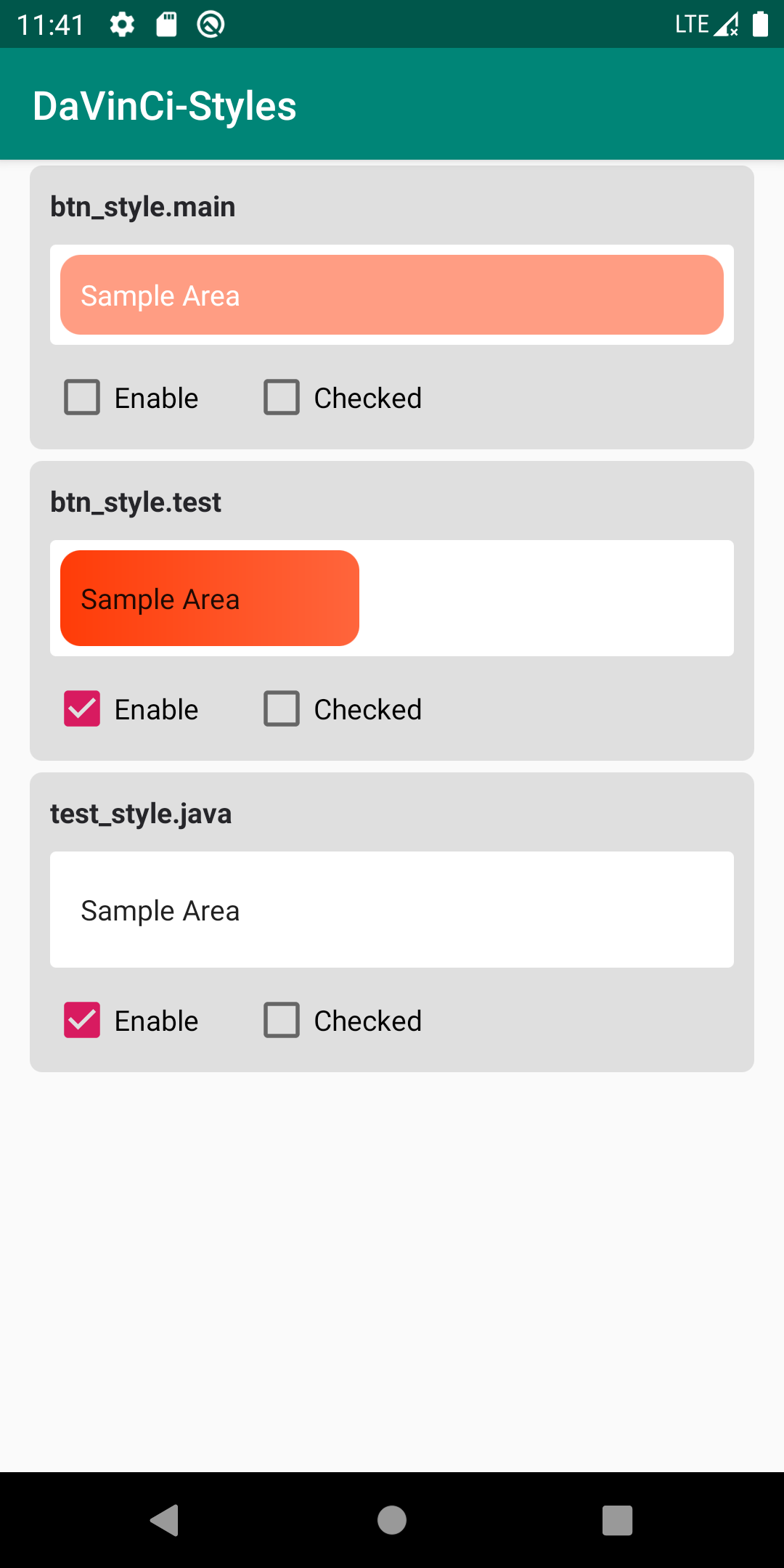
很显然,条目第一行是样式名,第二行是预览区,第三行是Check和Enable的设置,更多设置将会逐步开放。
利用注解可以进行一定的配置:
public annotation class StyleViewer(
    val height: Int = 48,
    val width: Int = -1 /*android.view.ViewGroup.LayoutParams.MATCH_PARENT = -1*/,
    val background: String = "#ffffff",
    val type: Int = FLAG_BG or FLAG_CSL,
) {
    public companion object {
        public const val FLAG_BG: Int = 1 shl 0
        public const val FLAG_CSL: Int = 1 shl 1
    }
}
- 设置宽高,单位dp,
- 预览区背景为白色,如果和样式比较贴近,可以设置背景区颜色
- 如果是明确的背景样式,且尺寸较小时,可以设置type为 FLAG_BG,移除文字显示
以后的工作
- 继续添加更加方便的API
- 扩展DSL
- 优化在Java/Kotlin 代码中使用DaVinCi的简便性
- 内部功能进一步解耦 如果有必要 , 可迁移到其他
- 优化预览
- 更多模态状态设置
- 搜索 如果有必要
- 分组 如果有必要
如果你觉得DaVinCi很有趣,不妨点个Star,欢迎一起交流想法。