Jetpack Compose | 控件篇(四)-- Box、Row、Column
在上一篇中,我们完成了 Switch、CheckBox、RadioButton 相关内容的学习,至此,最基本的简单控件我们已经学完,接下来我们将学习 基本的布局。
以Android 为例,我们已经完成了:
TextView、Edittext、Button、ImageView、CheckBox、SwitchButton、RadioButton等内容的学习。接下来将开始学习布局规则,例如:
FrameLayout、LinearLayout、RelativeLayout、ConstraintLayout等
文中代码均基于 1.0.1版本
如无特殊说明,文中的
Compose均指代Jetpack compose文中代码均可在 WorkShop 中获取,本篇代码集中于 post29 包下
完整系列目录: Github Pages | 掘金 | csdn
Box
类似Android中的 FrameLayout。
在UI设计中,不可避免的会将一些UI元素组合在一起,从外观上进行整体改变,将他们从环境中 "独立" 开来。很自然地诞生了这一方式:以一个节点包裹这些UI元素, 将整体外观设计运用于这一节点上。
注意:这个节点可以根据排布元素的需求灵活的选择布局 -- 在Compose中,这个节点可以是Box,但不一定必须是Box!
使用方式
@Composable
inline fun Box(
    modifier: Modifier = Modifier,
    contentAlignment: Alignment = Alignment.TopStart,
    propagateMinConstraints: Boolean = false,
    content: @Composable BoxScope.() -> Unit
)
很显然,这是一个内联函数,意味着它类似Facade模式的运用,其底层实现较为复杂,这里针对需求场景做了封装,隐匿了大量细节
在当前的学习阶段,我们克制住好奇心,先不探索细节。
参数含义:
- modifier: 修饰器
- contentAlignment:内容对齐方式 注意:这和FrameLayout有区别
- propagateMinConstraints:是否运用最小尺寸到内容,如果为TRUE,内容的最小尺寸将按照modifier中的信息进行设定,否则仅作用于Box
- content:内容 Android中子View的概念
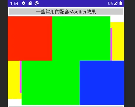
在WorkShop中,我们沿用了 Google的一个demo
Box {
    Box(Modifier.fillMaxSize().background(Color.Cyan))
    Box(
            Modifier.matchParentSize().padding(top = 20.dp, bottom = 20.dp).background(Color.Yellow)
    )
    Box(
            Modifier.matchParentSize().padding(40.dp).background(Color.Magenta)
    )
    Box(
            Modifier.align(Alignment.Center).size(300.dp, 300.dp).background(Color.Green)
    )
    Box(
            Modifier.align(Alignment.TopStart).size(150.dp, 150.dp).background(Color.Red)
    )
    Box(
            Modifier.align(Alignment.BottomEnd).size(150.dp, 150.dp).background(Color.Blue)
    )
}
在这个Demo中,我们可以看到:
- 对齐方式、padding 对 Box的 位置和大小所产生的影响
- 内容按照声明的次序先后进行排布
根据Box的布局限制调整内容
这是不同屏幕尺寸下的一种适配手段
这将使用到:BoxWithConstraints
@Composable
fun BoxWithConstraints(
    modifier: Modifier = Modifier,
    contentAlignment: Alignment = Alignment.TopStart,
    propagateMinConstraints: Boolean = false,
    content: @Composable BoxWithConstraintsScope.() -> Unit
)
和Box的区别在于 content,lambda中的上下文是 BoxWithConstraintsScope 实例,而不再是 BoxScope 实例,据此,我们可以在布局时获知Box的尺寸限制:
@Stable
interface BoxWithConstraintsScope : BoxScope {
    /**
     * The constraints given by the parent layout in pixels.
     * Use [minWidth], [maxWidth], [minHeight] or [maxHeight] if you need value in [Dp].
     */
    val constraints: Constraints
    /**
     * The minimum width in [Dp].
     */
    val minWidth: Dp
    /**
     * The maximum width in [Dp].
     */
    val maxWidth: Dp
    /**
     * The minimum height in [Dp].
     */
    val minHeight: Dp
    /**
     * The maximum height in [Dp].
     */
    val maxHeight: Dp
}
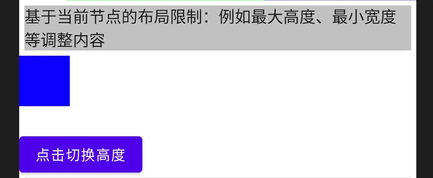
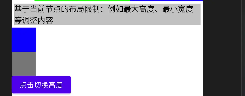
下面展示一个例子:
当Box最大高度小于100dp时,放置一个50*50dp的Box,否则纵向放置两个;初始高度为80dp,通过点击按钮在100dp和80dp间来回切换:
var height by rememberSaveable { mutableStateOf(80) }
BoxWithConstraints(
    modifier = Modifier.height(height.dp)
) {
    val rectangleHeight = 50.dp
    if (maxHeight < rectangleHeight * 2) {
        Box(Modifier
            .size(50.dp, rectangleHeight)
            .background(Color.Blue))
    } else {
        Column {
            Box(Modifier
                .size(50.dp, rectangleHeight)
                .background(Color.Blue))
            Box(Modifier
                .size(50.dp, rectangleHeight)
                .background(Color.Gray))
        }
    }
}

Button(onClick = {
    height = if (height < 100) 100 else 80
}) {
    Text(text = "点击切换高度")
}
效果
高度为80dp时,仅显示一个蓝色色块:
高度为100dp时,显示两个色块:
Row
在Android中,也有Row的概念 TableRow ,它被用在TableLayout中,作为表格的行:
public class TableRow extends LinearLayout {
    //...
}
和Android的 TableRow 类似,Compose中的Row效果等同于 横向的 LinearLayout
使用方式:
@Composable
inline fun Row(
    modifier: Modifier = Modifier,
    horizontalArrangement: Arrangement.Horizontal = Arrangement.Start,
    verticalAlignment: Alignment.Vertical = Alignment.Top,
    content: @Composable RowScope.() -> Unit
)
参数含义:
- modifier: 修饰器
- horizontalArrangement: 纵向上的范围
- verticalAlignment: 横向的对齐方式
- content:内容声明
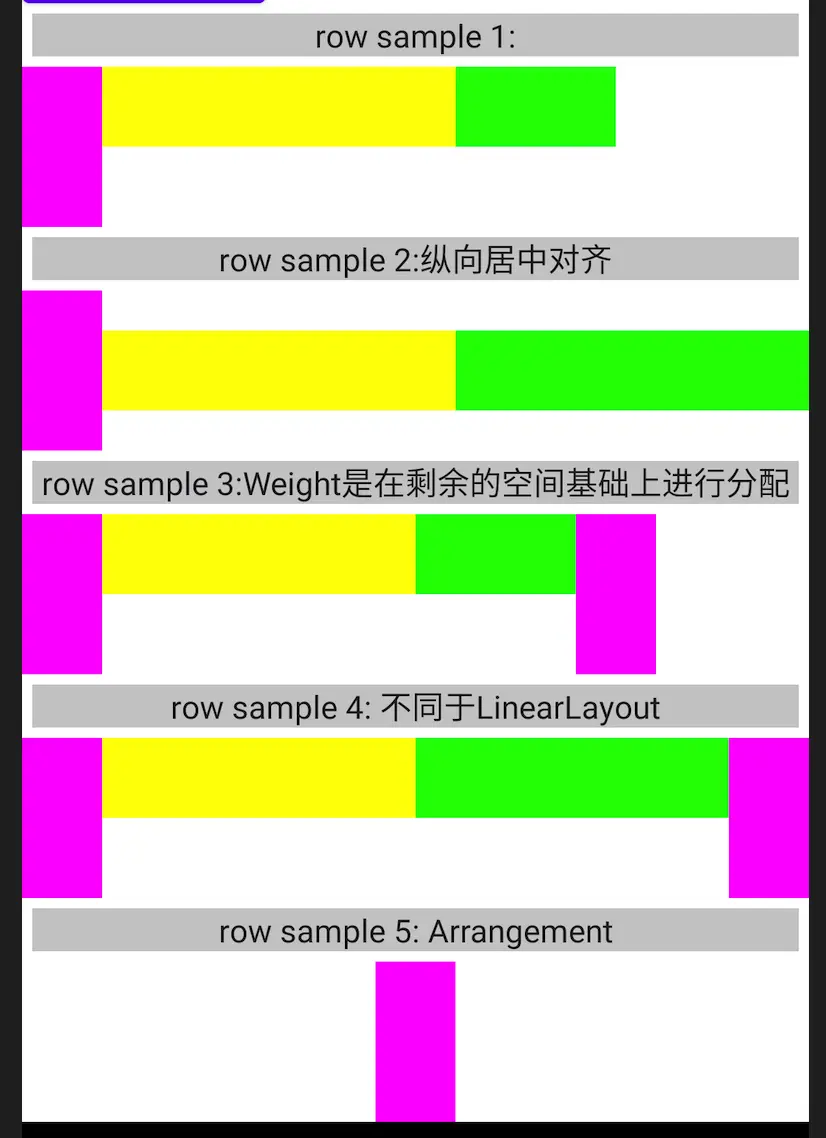
借用 Google的Demo
Row {
    // The child with no weight will have the specified size.
    Box(Modifier.size(40.dp, 80.dp).background(Color.Magenta))
    // Has weight, the child will occupy half of the remaining width.
    Box(Modifier.height(40.dp).weight(1f).background(Color.Yellow))
    // Has weight and does not fill, the child will occupy at most half of the remaining width.
    // Therefore it will occupy 80.dp (its preferred width) if the assigned width is larger.
    Box(
        Modifier.size(80.dp, 40.dp)
            .weight(1f, fill = false)
            .background(Color.Green)
    )
}
在一行中,先用掉 40*80dp的空间,剩下来的空间 (横向) ,利用Weight进行均分,如果不使用fill策略,将使用给定的宽度。
在WorkShop中,提供了更多的场景Demo,可以发现,使用Weight时,总是:先计算给定尺寸的元素,并对剩余空间使用Weight进行分配。
这一点和Android的LinearLayout相比要更加灵活、好用
纵向对齐方式
通过 verticalAlignment 可以指定纵向的对齐方式,例如纵向居中对齐:
Row(verticalAlignment = Alignment.CenterVertically) {
    //...
}
可以使用:
- Top 顶部对齐,默认
- CenterVertically 居中对齐
- Bottom 底部对齐
横向范围
当Row的尺寸大于内容的尺寸时,可以调整内容的位置:
例如横向的居中
 Row(
    modifier = Modifier.fillMaxWidth(),
    horizontalArrangement = Arrangement.Center) {
    // The child with no weight will have the specified size.
    Box(Modifier
        .size(40.dp, 80.dp)
        .background(Color.Magenta))
}
效果
Column
和 Row类似,但排布方向为纵向
读者可以自行编码以尝试效果,不再赘述
使用方式
inline fun Column(
    modifier: Modifier = Modifier,
    verticalArrangement: Arrangement.Vertical = Arrangement.Top,
    horizontalAlignment: Alignment.Horizontal = Alignment.Start,
    content: @Composable ColumnScope.() -> Unit
)
参考Row的使用方式
结语
很快又到了说结束的时候,本篇中,我们一同学习了Compose中最基本的布局方式,当然,还有一些问题没有继续往下探索:如果内容超过容器的大小该如何处理呢?
我们将在后续的篇章中继续探索。